Frequently Asked Questions
The direct answers
What does "free page analysis" actually mean?
Submit your URL and we'll look at the page, identify the 5 highest-leverage improvements, and send them back with specific reasoning, ranked by expected impact. No sales call required. Just audit@crazyegg.com within 48 hours.
Do I need to already have behavior data on my page?
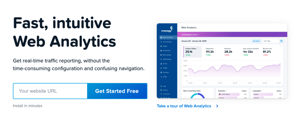
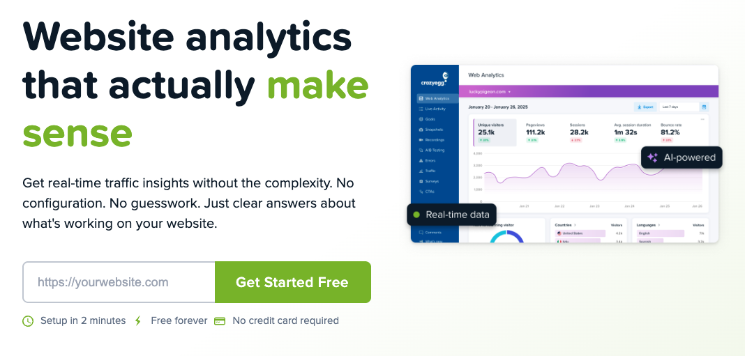
No. If you don't have Crazy Egg running, we'll set it up during the audit phase. We typically collect 1 to 2 weeks of data before making changes. If you already have data, we start immediately.
What does a full sprint cost?
A Full Page Audit is $499 per page. We set up Crazy Egg, collect 2 weeks of behavior data, and deliver a written diagnosis with 8 to 12 prioritized changes. The Full Sprint starts at $2,500 per page and includes the audit, a redesigned page, and a running A/B test. See the
pricing section for details.
What do I get at the end of a full sprint?
A production-ready page, the A/B test results, and a plain-English write-up of what changed and why. You own everything. If the variant wins, you keep it. We hand over the page, the data, and a full explanation of what drove the result.
What kinds of pages does this work for?
Landing pages, product pages, pricing pages, and any page where the goal is a specific action: signup, purchase, contact, or download. Pages with real traffic get faster results because we have more behavior data to work from.